
I was talking with my teammates the other day and realized that there are people who never got to experience the majesty that was GeoCities. That sent me scouring the web and trying to find the original GeoCities-izer. The amount of digging I did was high, the amount of my normal web safeguards I ignored…another. Everything pointed to one thing - 404 errors. Then it hit me, someone had taken down one of the web’s greatest achievements. The GeoCities-izer, granted, had issues: with the web being nothing but JavaScript and dynamically generated content, the effects were lost. So, being of questionably sound mind and armed with tokens, I produced the sloppiest of AI slop. I present. The GeoCities-izer 2026.
What it is#
This system has two modes: you can use a bookmarklet or a proxy running on localhost. I turned JavaScript against itself, the entire effort lives inside this bookmark. Proxy mode, this beauty strips the JavaScript “prettification” we’ve done to the web right out and injects itself. The bookmarklet however runs alongside everything so websites that dynamically generate your content also get the same treatment. Nothing is safe, nothing is sacred. From there it opens a portal to 1998 and an army of sirens, midi files, under-construction GIFs, web rings, all sally forth to enhance your web experience. It also injects a lovely little toolbar I affectionately call the “Obnoxiousness Dial”.
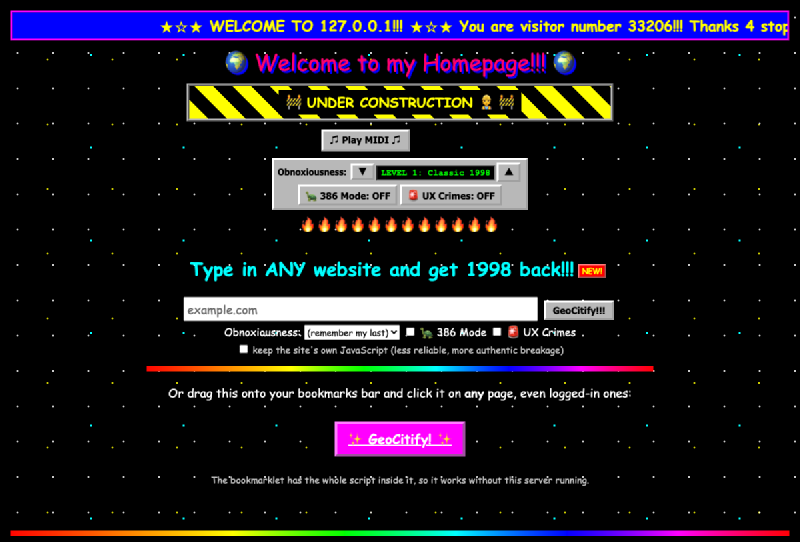
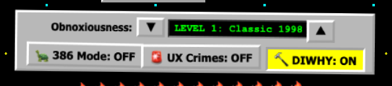
The Obnoxiousness Dial#
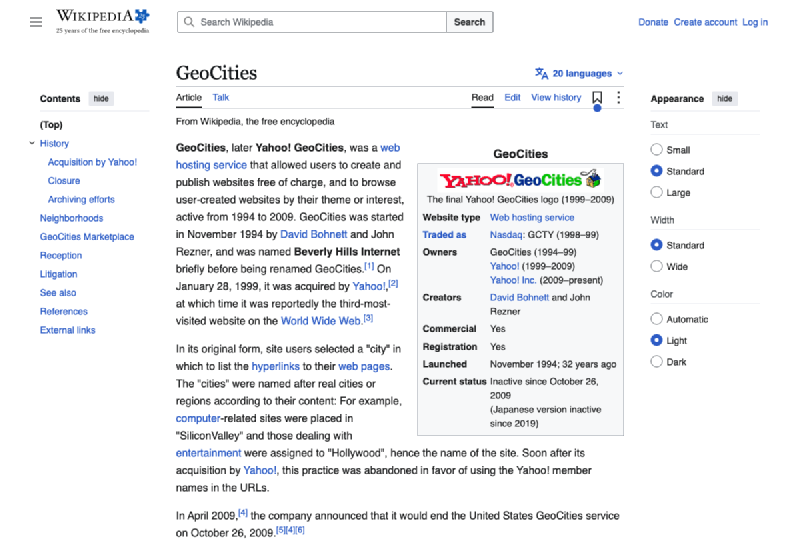
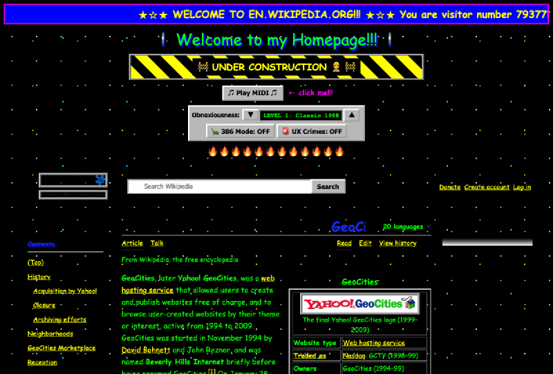
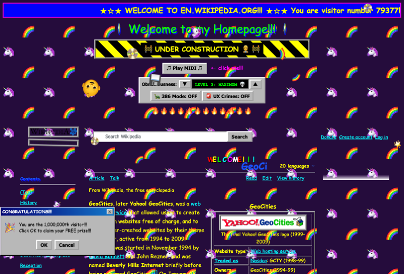
This little beauty has a cutting edge Windows 95 gray bar that has a beveled control with a simple up and down arrow and a little feedback about what you’re seeing. Higher levels = more awesome! The first level is classic 1998. Comic Sans everything, rainbow headings, blinking text, marquees, wobbly images, UNDER CONSTRUCTION GIFs, guestbooks, web rings, and a sparkle cursor trail to name a few.
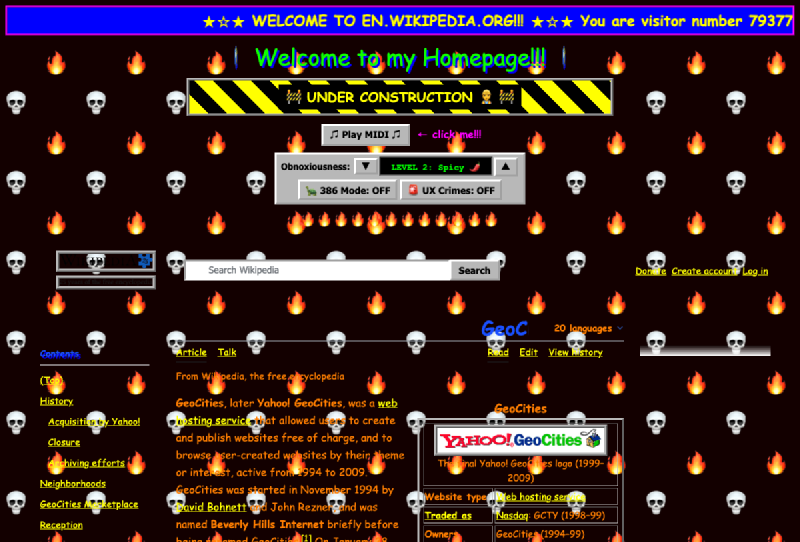
Second level of awesome, it picks a random neighborhood theme, and adds a fake Netscape status bar that never stops saying “Contacting host…”
Third level of maximum awesome. Draggable Windows 95 style pop-ups, no right-clicking, floppy disks raining from the sky, a bouncing baby and the letters “WELCOME” chase your cursor like you’re Pac-Man and they’re the ghosts. This whole thing is Y2K compliant in case you were worried.
But wait, there’s more…#
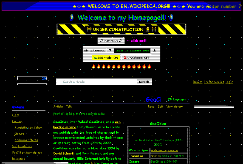
386 mode. Ever wanted to know how web pages loaded back when we could buy “The Internet Yellow Pages” …yes, a real product of yesteryear. This interlaces your graphics, simulates dithering images down to 27 colors, injects scanlines and you get an hourglass cursor until it says “Done”. Since I wanted to simulate the actual dial-up experience, pages render from top to bottom, and random parts stall for “loading”. I believe the kids would say this is “a vibe”, I call it “Wednesday Afternoon, 1997”.
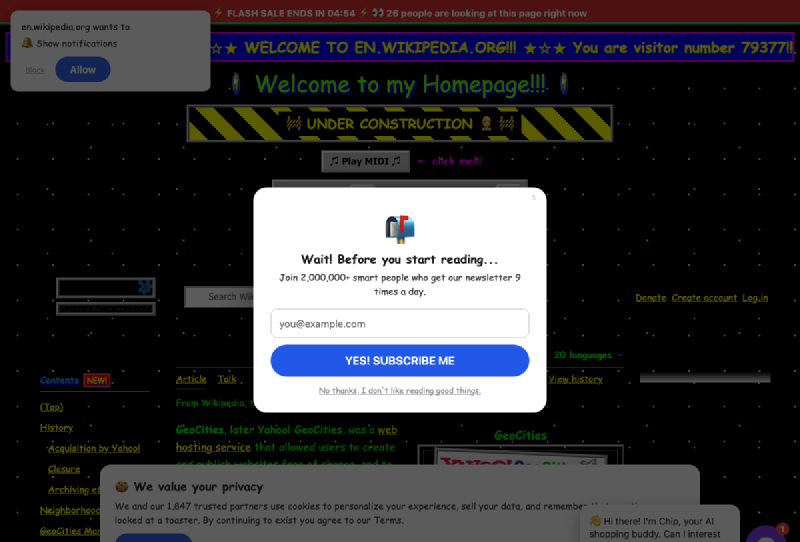
UX Crimes. This takes a turn down a dark alley of internet history. Sure, the ’90s made questionable design choices, what did you expect from kids raised on hose water and neglect? This mode however commits all of the crimes. A massive cookie wall with confirmshaming, scroll-jacking, clipboard injections, a Captcha that always fails twice before eventually shrugging and letting you in anyway…this one has it all. None of this crap is real, it’s just simulated terribleness brought to you by leaving eDonkey open to the world for a few hours.
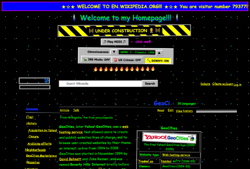
DiWHY. This one is close to my heart. Anyone who knows me, knows that my biggest complaint with AWS until the last interface redesign was the !@#$%^ alignment in the EC2 Load Balancer menu for checkboxes. This takes that whole frustration and cranks it up to 11. Everything is off by a pixel…if you’re lucky. Elements are off by 2-5 pixels, tilts happen up to a full degree. The deeper the nested element, the worse it gets. This is modern web design done with Notepad and reckless abandon. You can also toggle off all the GeoCities enhancements and view my annoyance in full-screen modernity.
Conclusion#
Go on, take it for a spin. The code lives over at gitlab.com/klevermonicker/geocities-izer. Buy me a coffee if you want, or just use it to torment your local UX person. After all, how would they know you care if you didn’t attempt to give them a permanent eye twitch?